Statement of intent for portraits:
I have been given the theme portraits. When I was given this theme I didn't know how it was going to turn out because I don't really like portraits. This is because I get embarrassed doing the shoots but I will do them anyway for the course. I will have different elements within my portraits project such as sports, casual, smart, etc. Because of corona I have missed out on a few good shoots to broaden my project but I am hoping to get back on track throughout this year.
For my research, I plan on finding photographers known for there work on portraits and try to imitate there work in my on style. It would be good to try and do some manipulations in the style of Antonio Mora because it looks quite unique and interesting. He uses double exposure which looks very complex, but also makes it look quite moody. Another photographer that I could potentially imitate is Yousuf Karsh because his images are very standard and easy to do but they look really nice and classy.
My first shoot will be a sporty shoot with the class for practice but after that I would want to do more casual shoots and manipulate them to make them more complex and interesting. However, I could try to experiment with different lighting and backgrounds throughout my different shoots to see what works best with each style. I would want some of my shoots to end up looking like Antonio Mora's because I like the way his manipulations look and if mine were to look like that it would make my final gallery more intriguing and would interest the viewer. My shoots will be in a studio mostly because that way I can add my own lighting and change the atmosphere as I see fit.
Doing this project I hope to learn how to make a good double exposure manipulation with Photoshop because this would help my gallery become more complex and I could use this skill in the final exam. It would help a lot if I could improve my overall Photoshop skills during this project because that would help in other projects and the exam. I could use the flash on the canon camera to make the photos look better by adding a shine to them. Using a dark room would be beneficial for this project because I can add my own lighting and manipulate the studio to make it suit my wants for the final product.
I hope to learn more about Photoshop and manipulating my photos without a tutorial. My framing could use some work because in my last project some of my framing wasn't that good, so to improve that in this project would result in better images for my final gallery.
My final format will be a gallery filled with my best work throughout this project, meaning I will need to make good enough manipulations for the final gallery. This could include the before and after's of my best manipulations, or just a gallery filled with the best images overall.
Mind map portraits:
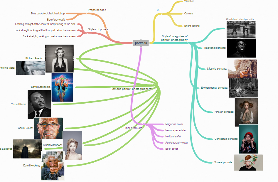
Photo analysis 1:
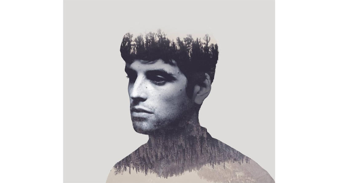
In this picture there is a man and the photographer/editor has added a double exposure to him. There is no background to make you focus on the subject. The man has been made black and white. This image is very unrealistic because the edit has made it so, this creates a theme of creativity and imagination which emphasizes the effectiveness of the edit. The trees on his neck have been flipped to add an effect. His hair has been merged with the darker trees to add another effect. The background is very similar to the subject's face which could create a nice effect but I (personally) would make them contrasting. There is a contrast between the roughness of the texture part of the image and the portrait part of the image because the man’s skin is smooth but the trees are rough. The texture part of the image could convey the subject's thoughts, he could be thinking about wildlife and nature and the image could be a representation of that. The fact that the subject's facial expression is so bland could be a representation of him being unconsciously thinking about nature. This can be considered a high key image because there seems to be more whiter shades than there are darker, also the background is a lighter shade. When you look at this picture you could feel a depressing or gloomy atmosphere, however some may feel a sense of peace and relaxation.
There is only the subject in this image, making you focus on the subject. The hair of the subject could be classed as a sweet spot because his hair is the same colour as the trees making it better for the effect. The photographer has used a central focal point. Making you eye level with the subject therefore adding effect to the image. To me the leading lines in this image could be where the trees on the bottom half are all pointing down making your eyes follow along. I think a high f stop would have been used because there is no reason for it to be low as there is no background (somewhere around f/22). I think a fluorescent or tungsten white balance would have been used for the subject’s shot, but maybe a cloudy white balance for the texture part because there is a soft shine on the subject, however this could just have been the lighting. I don’t think the ISO would be too important here either due to the lack of background and the fact that it has been edited. I think the image could be a little more exposed to make the subject stand out from the background a little more, but other than that I think it is nicely exposed. The use of a tripod may have been used for the taking of the image because it has to be right for an edit like double exposure and a tripod would help get the right angle and height for the image. A key tool from Photoshop that would have been used is the quick select or object select tool to outline and mask the subject to take him out of his original image, unless he was already in front of this background. The main colour in the image is grey which adds a nice effect because it works well with the background and the colour of the trees. The image used for the double exposure could have been cropped to make a better effect. The clear area underneath the trees below the subject's head creates a nice frame for the image because it acts as an end line for the edit. The image is sort of in three rows, there’s the top third with the hair and the darker trees, the middle third with the subject's face and the final third with the trees and the clear space.
I like their work because of the editing used. I think the double exposure edit is very polished and sharp, the use of portraits mixed with texture is very interesting also. Their work links to mine because I have also attempted a double exposure edit which includes a portrait image and texture. Also the overall colour of the image links to mine because I have also made the subject black and white to fade with the background. Another link to my work is that they have used a central focal point, which is what most of my images are. A strength in this image is the hair of the subject. This is my favourite part of the image because I really like how the colours fade together because they are so similar, this makes the image flow very nicely and improves the entire picture (in my opinion). A weakness of this image could be how similar the colour of the subject is compared to the background. I think if the subject was to be a lighter or darker shade, it would have a better contrast and make the image look more exposed.
I want to be able to achieve this sort of image by using Photoshop on one of my portrait images and mixing it with one of my texture images. I would want my outcome to look very similar to this in the future because I really like this style of edit. I will use this image as inspiration to make my own double exposure edits and improve my overall grade by doing so. By doing this I could learn new techniques in Photoshop like how to select and mask within an image, how to make two different types of images flow aesthetically and how to contrast a subject with its background.
Photo analysis 2:

David Hockney’s ‘joiners’ photo collage.
This photo was developed in the early 1980’s by David Hockney. He finished this piece in Los Angeles. His goal was to result in work that has an affinity with cubism, discussing the way human vision works. Hockney was born on the 9th of July 1937, he was an English painter born in Bradford, he is considered to be one of the most influential artists of the 20th century. He has two residencies in California where he has lived since 1964. He was an important contributor to the pop art movement in the 1960’s. On the 15th of November 2018, his 1972 painting ‘Pool with two figures’ sold at £70 million at Christie's Auction house in New York City. His father was a conscientious objector in WW2. He was educated at Willington primary school in Bradford. He refused to write an essay required for examination to graduate because he believed he should be assessed on his artwork alone. He was awarded his diploma after the RCA recognized his growing talent. In 1974 he began a decade-long personal relationship with Gregory Evans who moved with him to LA in 1974 and as of 2019 is still his business partner. Hockney always returned to painting portraits in his career. He has created over 300 self portraits, while also creating portraits of his friends and family along with his past romantic interests including Peter Schlesinger and Gregory Evans. He created over 200 drawings of friends and family, etc. He first used Polaroid prints and 35mm, commercially processed colour prints. His creation of the ‘Joiners’ happened by accident, he took multiple Polaroid shots and glued them together without realizing they would become a composition of their own. When looking at the final product he realized it created a narrative, as if the viewer moved through the room, after this he spent more time with photography and left painting for a while. However, he became frustrated with photography and its ‘one eyed’ approach, so he returned to painting. Some of his work is representing his love for men like his’ we two boys together clinging’. His assistant died as a result of drinking drain cleaner after having alcohol, taking cocaine, ecstasy and temazepam on the 18th of March 2013. He was offered a knighthood but declined it before accepting an order of merit in January 2012. He also has a charity called the David Hockney foundation, their goal is to create more appreciation for visual art and culture.
This image contains multiple Polaroid shots of the same person from different angles doing different things, stuck together to form a ‘joiner’ image making it look like the person is moving. This image is a portrait of sorts containing multiple images of the same person. It represents a narrative, as though you are experiencing everything the person is doing. It makes a very unrealistic image because there are multiple images all containing different things and actions. The whole image is distorted and exaggerated on purpose to show a collage. It could be showing that things are different depending on how you look at them. Hockney calls these kinds of images ‘joiners’, this is because he makes them by getting multiple individual photos and sticking them together, forming a joint image. The person in the image looks annoyed which could create a stressful tone throughout the image. The fact that he is smoking could suggest he is stressed out and needs a break, adding to the stressful tone of the image.
The images of the man are almost positioned to show him in a triangle. There is a lot of blank space in the corners of the image and at the sides, showing spacing. Most of the pictures are close up and from a central focal point. There is a contrast within the tones at the bottom and the top of the image because the top seems to be darker and colder, whereas the bottom is brighter and warmer. There would probably be a high f stop because the background is out of focus so it should be around f/2.8. The man is taking up the whole of the foreground. It looks like in some of the images the white balance is ‘fluorescence’ making the image seem more blue along with the ISO being increased making the images a little darker. The lighting is very bright and white in the background in some of the images, contrasting with the darker backgrounds in some of the other images. He may have cropped some of the images to get the right piece he needed for the collage.
I like how the pictures are taken at different angles and different times making it seem like the person is moving. I don’t like how some of the images of the side of the person's head are detached from the rest of the body. The Polaroid images make the picture look more 1960’s instead of looking modern. The left side of the image is the man looking down, the middle of the image is the man starting to look up and the right side is the man looking to the left, this makes it seem like the person is constantly moving in the image from left to right, he is slowly looking from the floor to the left of him. Their images link to mine because I will also be looking to form a collage at some point. A strength of this image is that it makes the person look alive, like he’s moving throughout. A weakness of this image is that the image on the far left doesn’t fit well with the rest of the image.
I really like the idea of making a collage out of individual images from different angles and times. I would like to use this idea in my future shoots to make my images more complex and interesting.
Photo analysis 3:

This image was taken by Yousuf Karsh.
In this image, you can see a portrait of Martin Luther King. It is in black and white which could have been done through editing, however due to the person in the image it is most likely the camera being used, because of the time zone. There is a shine on the subjects head only on one side so there is probably a lighting tool being used. The background is very bland and empty but has a white aura around him. The background is also dark, this makes the subject stand out more than anything else you could possibly see in the image. His suit is dark which matches the background and the colour of the image overall. The subject is wearing a dark suit which gives the overall image a formal tone. The colours of the suit match the colours of the image as a whole, this adds a sense of correctness to the image, like it is supposed to be there. Martin's pose is as if he is in deep thought, this could also add to the formal tone; Given his reputation of fighting against racism, it could be concluded that he is thinking of a way to prevent it. This could be classed as a low key image because there are more dark shades than there are lighter shades. MLK's facial expression is quite static and bland: This could be suggesting he is in such deep thought, his body has frozen and is unaware of it's surroundings. When you look at this image, you might start to feel calm and relaxed because of the darker shades, however the darker tones might make you feel depressed or even anxious. In a way the darker shades could also make you feel bored and tired.
The foreground contains the subject on his own which could convey a theme of loneliness or isolation and the background is a dark backdrop as to make the foreground more visible and prominent. The framing of the background being very dark helps the focus to be put on the subject only. The image has a sweet spot within the subject's face because there is a shine on his face which separates it from the rest of the image as it is a lighter shade, this creates contrast within the image. The photographer uses a close up central focal point looking straight on at the subject which adds a more natural effect to the overall image because it might feel like you are there looking at him, compared to say a birds eye view because it is unlikely that you will be looking at someone from that angle on average in a natural environment. There is a low depth of field which means the f stop would have been around f/2.8 because the background is less visible than the foreground as to make the foreground more prominent again. It is a studio shoot so the white balance would have to be tungsten or fluorescent because those are the main white balance settings you would use indoors, other settings like cloudy would be used predominantly outdoors. The ISO would be around 800-1200 because it isn't dark but it's not bright, however the black and white makes it hard for the ISO to be estimated. The photographer has more than likely used a tripod for this image because it is a portrait studio shoot and they are usually important for taking in focus images in portraits. The image isn't overly exposed which makes it more aesthetically pleasing. The main colour in this image is black which could create a depressing atmosphere, however it could arguably make it more professional because there are no colourful elements, which makes it seem more mature in a sense. As the subject is MLK it is highly unlikely that this image has been manipulated by Photoshop or any other editing platform because of the time. The picture looks to be split in half with one side being darker and as you go across the image, it gets lighter. This also creates a great contrast within the image.
I personally like this picture because it looks very stylish and professional because of the subject's posing and the tone of the overall image being serious and dark. This links to my work because I too have made images where the image seems to be in deep thought and looks quite static, also by using a backdrop to highlight the subject. A strength of this work is the use of lighting to make half of the image darker and the other half lighter because this adds a contrast between the two halves of the image. A weakness of the image is how close the background colour is to the overall image's, personally I think the image could be improved if the background had a bit of contrast with the subject. I would like to achieve this sort of image because I want this kind of professionalism in my final gallery to achieve a higher grade and show that I can make a quality image like this one. I can use this image for inspiration for poses and the use of lighting. I would like some of my images to look similar to this but have most of them personal to me because that's how I would get higher marks.
Poses:


Editing with movement:


Editing with effects:


Plan for shoot:
Name:
Luke Frame
Project Title/ shoot number:
Portrait photography
Description of aims for shoot:
I will take portrait photos of people in sportswear. I want to get some poses where the subject is moving because it will make it look more natural, but also some poses where they aren’t moving, in a normal position.
Links with Photographers:
I could try to mimic Michael Willson because his work is also linked to sports and athleticism like mine is going to be based on.
Location:
This shoot will take place in a studio setting.
Props/ items needed:
The only sort of prop I will need for this shoot is sportswear for the subject.
Kit needed e.g. lighting, tripod, backdrop, macro lens:
For this shoot I might have to use bright lighting and a dark backdrop, tripod.
Camera settings I will use:
F-Stop :
I might want to use a 1.0 f/stop because it will be better for bright lights and won’t capture as much of the background. However I could experiment with around 2.8 or 2.0.
White Balance:
I might leave my white balance on auto because I might be changing the lighting throughout the shoot, therefore the white balance will constantly be changing.
Shutter speed:
My shutter speed would need to be around ½ for catching movement as some poses may need this or I could use around 1/500 for normal poses.
ISO:
My ISO will be around 800 because the lighting should provide most of the light, the ISO won’t have to be bright or dark.
Which compositional rules will I use?
(Rule of Thirds, even numbers, odd numbers, symmetry, asymmetry, leading lines,
patterns, repetition, triangles, birds eye view, worms eye view, central focal point)
I will try to experiment with the central focal point and worm's eye view. I could also try to use symmetry and patterns to make the photo more appealing.
Portrait shoot 1:
Shoot 1 studio:


Best:
This is my best image from this shoot because you can't see anything in the background like the chairs or the railings that you can see in the other images. The ISO makes the image clearer because it's not too bright or too dark I think it would be around 400 in this image, or even 200. The F stop makes the background (yellow backdrop) out of focus so that the person in the image is the main subject, I think it would be at around f/2 for this image. The auto white balance means the image isn't too bright or dark and doesn't have a blue or orange essence and because it is inside the white balance could potentially be tungsten or fluorescent. The shutter speed wouldn't be too high because the subject isn't moving, this would mean I could leave it at around 1/40 or lower.
|
Worst:
This is my worst image form this shoot because the angle makes the person's head look distorted and unnatural, you can see the stand from the backdrop and it is too close up, this makes the image look unnatural and poor. The ISO was the same as my best however, around 400. The shutter speed would also have been the same as my best because at this point I hadn't changed any of the settings yet, so it would be about 1/40. The white balance was on auto here as well which meant I was able to avoid a tint. The f stop is making the background out of focus, however you can see where the backdrop cuts off so it's not that important for this image, it would be around f/2. If I could take this image again I would change the angle to make the model look better and also make sure the backdrop is in the whole image.
|
Portrait shoot 2:
Shoot 2 studio:


Best:
This is my best image from this shoot because it has spacing, a little bit of worms eye view, the angle isn't just direct which would make it look a little boring. The white balance would have to be tungsten or fluorescent because it's a studio shoot inside, however for this shoot it was on auto. The ISO for this image would have been kept low because it's inside (200 or 400), this would mean there isn't too much light coming through which could have made it over-exposed. The shutter speed wouldn't be too high because the subject isn't moving, meaning it is most likely around 1/40. My F stop is hard to decipher because the background is black, however as my plans didn't involve a background it should be kept low to draw more attention to the subject, it was probably around f/2.
|
Worst:
This is my worst image of this shoot because the aperture makes it out of focus and the person is looking right at the camera making it less natural. I have used central focal point which makes it look a bit boring. My F stop is hard to decipher because the background is black, however as my plans didn't involve a background it should be kept low to draw more attention to the subject, it was probably around f/2. The ISO for this image would have been kept low because it's inside (200 or 400), this would mean there isn't too much light coming through. The shutter speed wouldn't be too high because the subject isn't moving, meaning it is most likely around 1/40. The white balance would have to be tungsten or fluorescent because it's a studio shoot inside, however for this shoot it was on auto. If I could retake this image I would change the aperture to make the subject focused and change the subjects pose because it's a little static and boring.
|
Portraits shoot 3:


Best:
This is my best image from this shoot because the background is so white that the only thing you can really see is the subject meaning your eyes will be drawn to him straight away. It has worms eye view, it's not direct at the subject, the angle isn't just straight at the subject either it's on it's side, this could make the subject seem dominant. The subject is in a natural position also, making the overall image seem more natural. My shutter speed for this image would have to have been a little higher than usual because I needed to capture the image while the subject was moving, I think the shutter speed would be around 1/250. The F stop for this image would have been low because I was outside and I didn't want to get any of the background in focus, however there is only the sky in this image so it's hard to tell what the Fstop is. Although I would assume it was around f/2. The ISO was a little higher than I think I should have had it because I was outside but it was around 800, this meant the overall image was brighter, but it may have made it too bright. My white balance was on auto for this shoot but as this was outside I think it could have been cloudy or daylight.
|
Worst:
This is my worst image from this shoot because it has been disrupted by the other photographer. Also, the door is in the way of the image. The F stop for this image was too high as well because the brick wall behind the subject is too in focus, I think it would be around f/16 or a little lower. The shutter speed wouldn't have had to be too high as the subject wasn't moving, but you can see the other photographer walking past and this means the shutter speed would still have to be higher than it should have been, I think it was around 1/60. The ISO for this image was around the same as my best (800) but it's inside so it would look darker anyway. Again the white balance was on auto for this image but if it wasn't I would recommend cloudy for this picture. If I could retake this image I would wait for the other photographer to be out of the way before taking the picture.
|
Portraits shoot 4:
Shoot 4 studio:


Best:
This is the best image from this shoot because there is no disruptions, the image is clear, it looks natural because the subject isn't looking straight at the image, he is in a position that could be used for an advertisement or something similar to that. The white backdrop makes the subject stand out more because he is wearing contrasting colours with it. The ISO for this picture was around 200 as it was inside and it didn't need to be high, this makes the image dark enough for it not to be over exposed. The shutter speed wouldn't be too high because the subject isn't moving, meaning it is most likely around 1/40. The F stop makes the background out of focus so that the person in the image is the main subject, I think it would be at around f/2 for this image. The auto white balance means the image isn't too bright or dark and doesn't have a blue or orange essence and because it is inside the white balance could potentially be tungsten or fluorescent. The use of spacing mixed with the white background creates an atmosphere of nothingness behind the subject, which makes him the main focus. Also the use of a central focal point makes the image more natural and gives off a sense that you are looking right at the subject in person.
|
Worst:
This is my worst image from this shoot because the entire background is in focus and in the shot, meaning the f-stop is most likely too high for this specific image. I had the subject stand still for this shoot as there wasn't a lot of space to work with, therefore the shutter speed wouldn't have had to be as high. The white balance was still on auto at this point so I didn't have to worry about it, however as this image was taken inside, if I was adjusting it manually I would've made it either tungsten or fluorescent as they were recommended for indoor shoots. The ISO in this image was a little too high as it was too bright, too much light was being reflected on the lens. The framing in this picture was poor because you could see everything behind the backdrop. I think there was too much spacing and in result too much of the backdrop was visible. If I could retake this image I would change the framing of the image so that more of the subject is in the overall image and you can't see what I didn't intend for you to see.
|
Sport edit:


Before:
After:

To make the smoke effect on this edit I have used the paint brush tool to add some differently shaped cloud-like backgrounds to the image. I had to use the quick select tool to cut out the subject to add to the base background. This links to my mood board because it has similarities to the smokey images.
Plan for 2nd shoot:
Name:
Luke Frame
Project Title/ shoot number:
Portrait photography
Description of aims for shoot:
My aim is to take a good amount of photos of different models in different poses with a light backdrop and use different angles to show my skills with compositions.
Location:
This shoot will take place in a studio shoot
Props/ items needed:
The only thing I might need need for this shoot is something for the model to sit on.
Kit needed e.g. lighting, tripod, backdrop, macro lens:
The kit I will use for this shoot would most likely include bright lighting and a dark backdrop, tripod.
Camera settings I will use:
F-Stop :
My f-stop won't have to be large or small because nothing will be in the background.
White Balance:
The white balance will depend on the backdrop so it is hard to assume what white balance I will be using.
Shutter speed:
The shutter speed won't be too high because the model shouldn't be moving.
ISO:
The ISO will also depend on the backdrop because a lighter backdrop will have a different ISO to the darker backdrop.
Which compositional rules will I use?
(Rule of Thirds, even numbers, odd numbers, symmetry, asymmetry, leading lines,
patterns, repetition, triangles, birds eye view, worms eye view, central focal point)
My model Ismail photoshoot:


|
Best:

This is my best photo from my model Ismail's shoot because my ISO made the photo brighter, therefore you could see the contrast in his yellow jumper and the white background, because it is inside the ISO wouldn't have to be that high meaning it was probably around 200-400. The framing in this image helps as well because the space at the top draws your eyes to the model because there is nothing in that area. The model isn't looking straight at the camera giving it a more natural atmosphere. Also this image is one of the few images with this model that's in focus, obviously making it more appealing. The white balance makes the image more natural because it is at the right setting, it's not making the image blue or orange, it works well with this lighting. The F stop is wouldn't have to much of an effect on the image because there isn't really a background to worry about, therefore I would have kept it low (around f/2). My shutter speed wouldn't have to be very high either because my model wasn't moving in this image, therefore it would've been low at around 1/40.
|
Worst:

This is my worst image with this model because the framing is bad, there is too much space above the subject. It is out of focus. The lighting is reflecting off of the models glasses making it less natural, also you can see the subjects shadow adding to the fact that it doesn't look natural. The lighting behind the subject makes the background unappealing because the shadow makes it bright in some places and dark in others. The ISO for this image was too low, I think it should have been higher because it is making the picture darker than it should be, it was probably around 200. The white balance was on auto for this shot, so I doubt that would have been an issue. The F stop could have been higher in order to make the shadow out of focus, I think it was too low at around f/2. The shutter speed wouldn't have to be very high either because my model wasn't moving in this image, therefore it would've been low at around 1/40. If I could retake this image, I would make sure the shadow was out of focus. I would also change the angle because it just looks unnatural.
|
My model Isabela photoshoot:


Best:
This is my best image with this model because, it is the only one that was in focus. The background was in the frame but the other photos weren't in focus. The lighting made the atmosphere feel warm and the model wasn't too bright.
|
After:
This is my worst from this model because they blinked while I was taking it and it made their eyes freak out. If I could take this image again I would make the f/stop and shutter speed lower so that it wouldn't capture the blink.
|
My model Nihaal photoshoot:


|
Best:

This is my best image with this model because the lighting made the background stand out more than the other images and the spacing meant I could fit the model in whilst also showing how vibrant the background is.
|
Worst:
This is my worst image because it is out of focus and the background was in the frame. The lighting isn't good for this angle because half of his face was light and the other side was dark. If I could retake this image I would make sure the background wasn't in focus and I would make sure the image is in focus.
|
My model Daniel photoshoot:


|
Best:

This is my best image from this shoot because it is the closest one to being in focus and the lighting helps with being able to clearly see the model, because one of the other images is too dark.
|
Worst:

This is my worst image with this model because it was out of focus, the lighting was poor and the white balance was on the wrong setting (I don't think it was on tungsten or fluorescent). To improve this image if I could take it again, I would change the lighting, make sure the picture is in focus and change the ISO or aperture to make the image brighter.
|
Plan for shoot 3:
Description of aims for shoot:
I am going to go out around the city taking pictures of my model in different places and poses. I want to experiment with different angles in this shoot as well.
Location:
I am going to be going to different places around Salford Qays.
Props/ items needed:
I won't need any props for this shoot because it's going to be outside and around multiple locations.
Kit needed e.g. lighting, tripod, backdrop, macro lens:
All I will need for this shoot will be a camera.
Camera settings I will use:
F-Stop :
Because there's no backdrop, the F-stop will have to be lower because I will need to make sure the background is out of focus in my images. I think somewhere between 1.0 and 4.
White Balance:
As the shoot will be outside, the best choices for white balance would have been either daylight (5500K), cloudy(6000K) or shade(7500K)
Shutter speed:
The shutter speed shouldn't have to be too high because the model won't be moving and it won't be too dark.
ISO:
As this shoot is outside, the ISO might need to be a little lower because the sun will be giving all of the light.
Imperial war museum:


Best:
This is my best photo from this area because I have used spacing, the whole image is in focus and I adjusted the ISO so that it wasn't too bright. The pattern in the background makes the image more appealing to the viewer and the way the model is standing makes it look more natural because he isn't looking right at the camera. Also the white balance is making the light intensity work with the image.
|
Worst:
This is my worst image from this area because I think the ISO made the image too bright and the background has too much focus meaning the attention won't be all on the subject. If I was to change anything about this photo, I would try to get closer to the model to limit the background.
|
Bridge:


Best:
This is my best image from this area because the background is out of focus and the foreground is in focus, causing all the attention to be on the model. The ISO makes the image bright enough for you to see the model clearly but not too bright that it's blinding. It's a good angle for the image because the model takes up nearly the whole image and for portraits this is good.
|
Worst:
This is my worst image because the ISO was too high for this angle and it caused the sun to interfere with the image making the model hard to see. If I could take this image again I would change the ISO and white balance to hopefully make it easier to see. I think the image is too far away from the model to have a good portrait image.
|
Media city:


Best:
This is my best image from this area because it has a good vibrancy and it makes the colours stand out, causing the image as a whole to be more appealing. The use of worms eye view shows off my skills as a photographer as well. The ISO makes the image bright enough for the area and doesn't look too bright. The background is out of focus and the model is in focus which puts the attention on the model.
|
Worst:
This is my worst image in this area because the framing is poor and the subject was in the middle of changing poses so the image didn't look as good as it would if he was doing a pose. It looks as though the background is more in focus than the foreground which means the /fstop is too high. If I were to retake this image I would re-frame it so the subject is in the right position. I would also make sure the foreground is in focus and the background is out of focus like the best image.
|
The Lowry:


Best:
This is my best image in this area because the background is out of focus and the foreground is in focus suggesting a good use of f/stop. The spacing makes the image look more complex because of the use of compositions. The ISO usage reduces the light intensity making it brighter but not too bright.
|
Worst:
This is my worst image because it is out of focus and there is a person in the background. If I could retake this image I would make sure the background was empty and the foreground was in focus.
|
Photo analysis edit:
Before:
After:
I used the picture of MLK in my photo analysis 3 as inspiration for a black and white edit but decided it wasn't complex enough to be continued.
David Hockney style attempt:
Before:
|
After: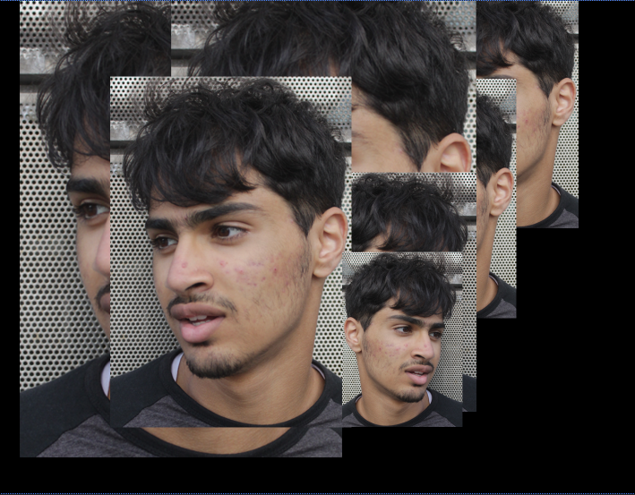
|
I attempted this style of work but thought it didn't look as good as my other work and didn't fit my style of work so I decided not to continue doing it.
Moodboard for double exposure:


Double exposure edits:


Before:
|
After:
|


Before:
|
After:
|


Before:

After:

I used the quick selection tool to cut out the subject and add him to the base background in all of these images . These link to the double exposure mood board because they were the main inspiration for how I was going to approach the edit. Some of mine, however, are a little different because the edit covers the entire subject, whereas on the mood board it is only a part of the subject, this makes my edits look more unique and therefore makes the overall style more personalised.
Decay effect moodboard:


Decay effect:


Before:
|
After:
|
Decay effect 2:


before:
|
After:
|
After alternative:
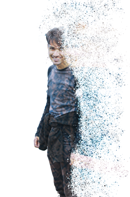
I used the quick selection tool to cut out the subject and add him to the base background in all of these images. I also used the paint brush tool to create the effect by adding the splatters to the surroundings of the subject which created the dissolving effect. These link to the mood board because they were the main inspiration for how I was going to approach the edit.
Dripping effect moodboard:


Dripping effect:


Before:

After:

I made two styles of background for this image but decided that this one is more effective:
After alternative:
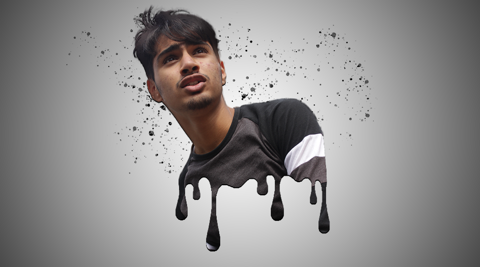
Dripping effect 2:


Before:
After:

To create this image, I had to use the quick select tool to crop out the subject and add him to the background for the edit. I used a rubber to make sure the shoulders of the subject were in line with the dripping effect, and also I used a paint brush tool to create the splattered background effect. These edits link to the mood board because they were used as the main inspiration for me to attempt this edit and it looks very similar to them.
Cartoon effect attempt:


Before:

After:


Before:

After:

In this style of edit I didn't have to crop anything or draw anything, I just mainly used the filter bar on Photoshop to add some effects to it and make it look unrealistic.
Edit mixture:


Before:
|
After:
|
I added a different styled background to my final piece but I decided that the previous one was better
Edit mixture 2:


Before:
|
After:
|
Edit mixture 3:


Before:
|
After:
|
Edit mixture 3:


Before:
|
After:
|
Edit mixture 5:


Before:
|
After:
|
Edit mixture 6:


Before:
|
After:
|
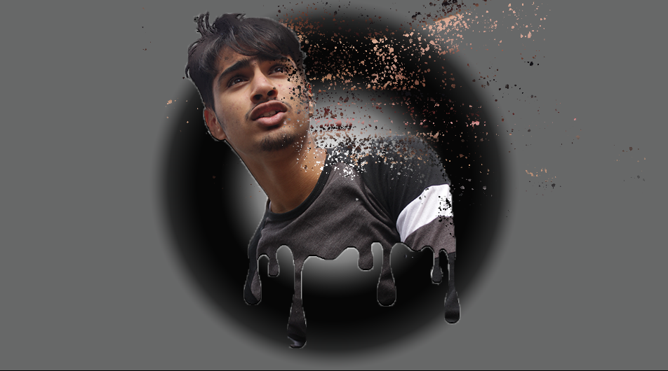
In all of these images, I used the quick selection tool to cut out the subject for the mixture. I then had to make a new layer for the edit and drag it under the current layer. I used liquify in the filter section to distort the image for later. Then you need to add a mask to both layers making sure the one beneath is black by holding alt while adding a mask. Then used the paintbrush tool to add a pattern to the surrounding area of the subject. Finally I used the paintbrush tool again on the other layer to show the distorted image beneath creating the decay effect. I also went back and added a gradient background to suit the subject's main colours. I also used the rubber tool to get rid of any of the excess paint that didn't fit the image, like if I got some in the middle of the subject by accident.
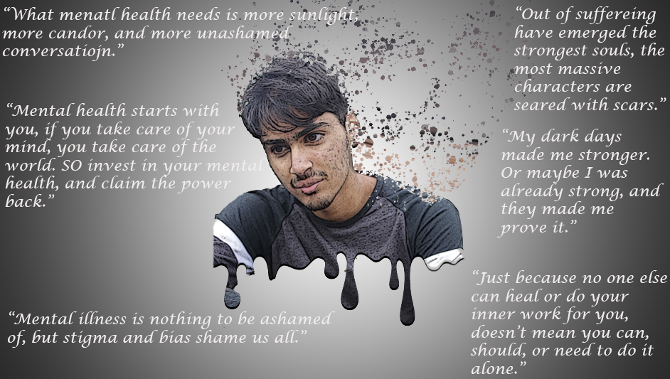
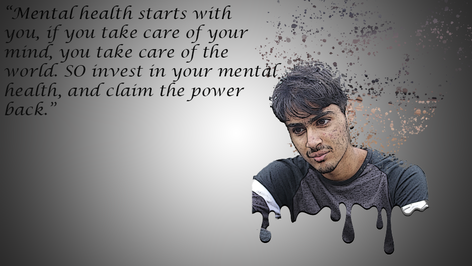
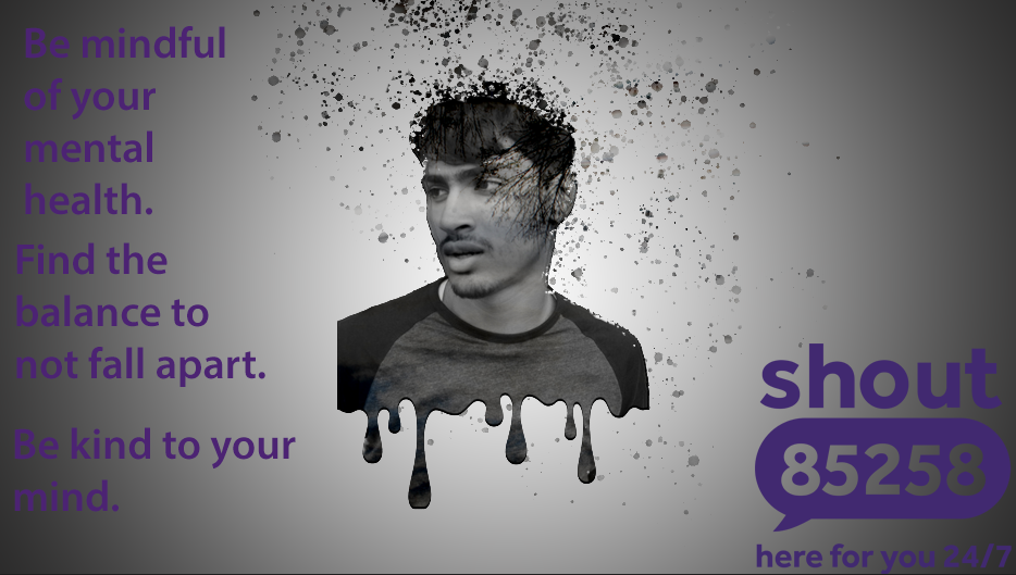
Mental health:
Mental health is always a high priority in school. From the first day of high school when you transition from a small classroom with the same 30 students and one teacher all day to massive numbers of students and teachers with so many different classrooms you have to find, there is always pressure and mental struggles. Trying to fit in, find new friends, getting used to the new environment and keeping in touch with your old friends, having a life outside school. When everything seems to finally fit, you reach year 11 where you have more pressure than before and everything falls apart again. You are having to do more work, teachers are making you work more after school, wanting you to reach a higher grade, the exam stress, having to pass to get to college, but you still find the time for a social life, you are still a teenager and you need to take care of your mental health because that is the most important thing at this point in anybodies life. You have to find a balance. There is a stereotype that men shouldn't talk about their mental health because they are supposed to be 'manly' and hide their emotions, and if they show their emotions they are seen as weak and 'feminine'. However it is very important that you speak up about your mental health because if you struggle alone, it will be a thousand times worse.
1.
2.
3.
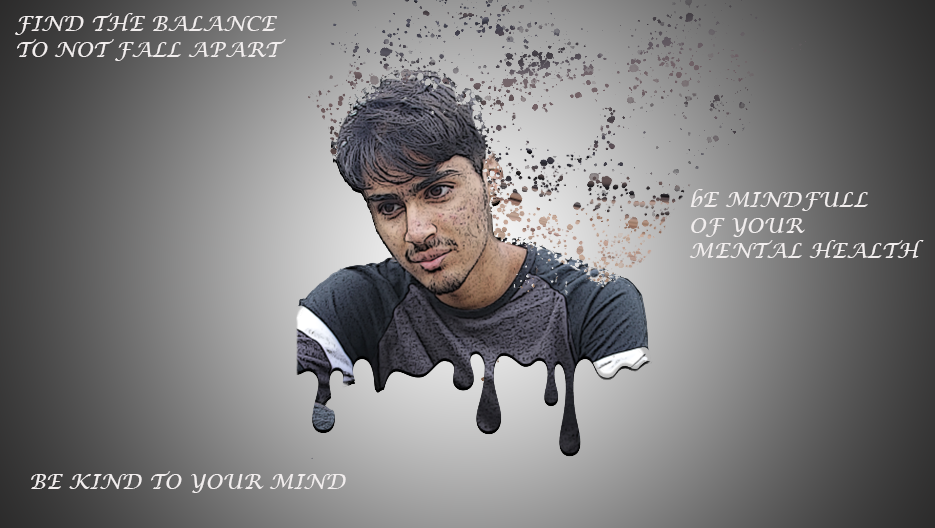
Following feedback I have decided to make the font of the words bolder to make them stand out.
4.
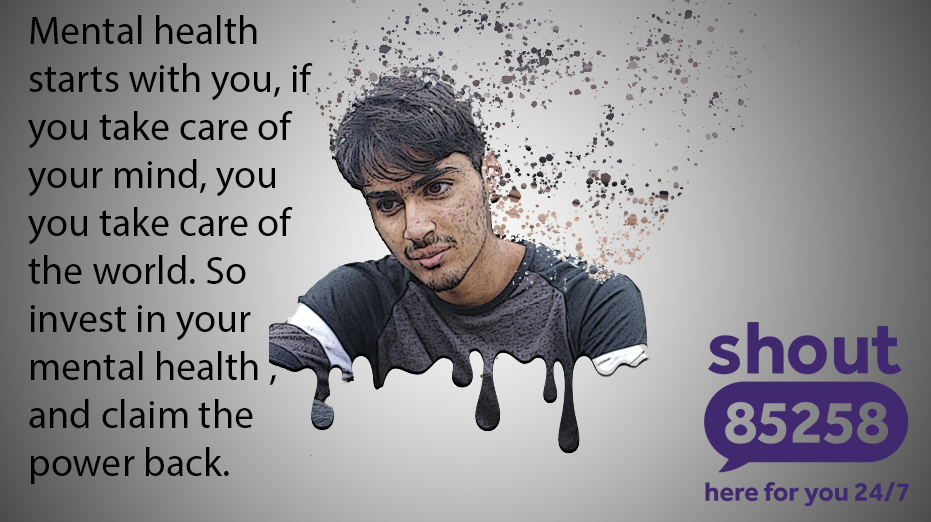
Following more feedback I have decided to make the words the same colour as the shout logo to make it more suited for the image as a whole.
5.
6.

Mock edit:


Final outcome:

|

|
I had to do this edit from memory and forgot how to do the decay effect so I would prefer to use the dripping effect for the final outcome but I tried to do the decay effect so I put that on there as well.
Final gallery:


Project evaluation:
This project was titled 'portraits'. I thought this project was interesting because it allowed me to experiment with new edits and style of shoots. I found the editing the most interesting part of this project because I was able to use different complex edits that I have never seen before like the dripping effect and the dispersion effect. I could also combine these edits to create an even more complex final piece. I have experienced new techniques like taking photos with different angles than I was able to with texture, the different poses I could have the subject in could effect the type of edit I did on it and I could experiment with different backgrounds and locations which I wasn't really able to do with texture. I would like to work on making the subject's pose suit the type of edit I will approach it with, like thoughtfulness or excitement, etc. Through this project there wasn't many photographers that did pictures like mine (which, however, made them more personal). Although I did research a couple for my analysis'. One of which was David Hockney who worked on photo collages. I wasn't influenced by these photographers to do the edits I finalized but I would have liked to do some in this style. I think my strongest part of this project was the triple edits I did with the cartoon effect, the dripping effect and the dispersion effect because it showcases my skills with photography and it looks really good for the final gallery. At the start of this project I encountered a few problems, one of which was that I didn't know what I wanted my final gallery to be and what kind of edits I wanted to do. However I then found how to do the dispersion and dripping effect and from then on I knew that I wanted my final gallery to consist of those edits. If I could complete the project again I would try to take more pictures overall and make the subject pose in a way that would suit the style of edit.
