Statement of intent:
The focus of this project that I have chosen is Light and Dark and I hope to show off my development with the skills needed to be successful within this project. I am planning to have some sub-headings within this project such as Light and Dark with man-made objects like glasses, flowers, etc. I want to use these props because I think I will be able to create some great effects and edits with them and I already have some ideas with them.
I intend to research multiple photographers who have worked in this style in order to gain a knowledge of understanding about the project and to get inspiration from professionals in order to improve my work within the different themes. Some of the photographers I might research include: Willy Ronis (he mainly works with shadows and reflections using life post-war), Horst P Horst (he mainly worked using people but also focused on things like flowers and created kaleidoscopes) and Alexey Bednij (works with manipulative black and white digital photography work. He captures the shadows of subjects such as people, cats, dogs, birds, etc, manipulating the shadow that it casts).
Some shoots I plan on doing is some work with light bulbs in a very dark room to isolate the light. I think having a dark room to do most of my shoots would be beneficial because I can use this to manipulate shadows and the overall lighting contrast within the images. Also I want to do some work with using different kinds of lighting and seeing how different light intensities can influence the shadows and silhouettes of objects. While also using natural light and using framing to my advantage to make the image lighter in one part and darker in the other. I could also take pictures of natural objects like leaves and grass and manipulate them in Photoshop to make them look like Horst P Horst's kaleidoscope images. I think I could make my work similar to Willy Ronis' work with natural light and also Alexey Bednij's work with shadows and silhouettes. However the project doesn't necessarily have to be black and white, I could use different shades of a colour going from light to dark or use Photoshop to add a hint of colours with light and dark shades to a black and white image.
Throughout this project I want to learn and improve my skills working with shadows and silhouettes. Learning to manipulate the light intensity to make shadows more or less prominent would be beneficial for this project because it could help me make the final gallery look more professional. Also angling the objects to make a shadow more or less prominent would further improve this project's quality. I am going to show my progression through the use of galleries hopefully becoming increasingly higher quality over the course of the project. I see my final product being a gallery of my best pieces being shown off clearly. To do this I could print them off and arranging them in different ways to make shapes, or I could just have a final gallery on the website but I think having them printed off and arranged will give me a higher mark.
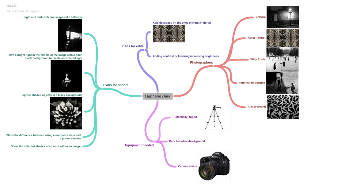
Mind map: Light and Dark
Willy Ronis moodboard:


Photo analysis 1:

This image is By Willy Ronis (born 14 August 1910, died 12 September 2009 at 99 years old), he was a French photographer best known for his work on life in post-war Paris and Provence, he is one of the photographers I am going to be researching for my project. It shows people ice skating in what looks to be a park in winter because the trees have hardly any leaves and there is snow. I would say the main subjects in this image are the man holding a broom and the man in the trench coat because they seem to be the only people in focus. Also they are both wearing all black while everyone else in the image is wearing lighter shades of clothes which make them stand out. Along with the fact that the man with the broom is very unnatural because you wouldn't need a broom on ice... the way he is holding the broom could look like he is dancing with it. The man with the broom and the man in the trench coat aren't wearing ice skating shoes as well which makes them stand out further because it now looks like they don't belong there. There is a huge contrast with the shade of the trees and the shade of the ice which makes the image look better. You can also see a bridge going over the ice which could suggest that the ice was originally a lake or a river which can make you imagine what the area would look like in spring or summer, which is another contrast within the image. An unusual thing I noticed with this image is that the trees in the background look a lot lighter than the darker trees closer to the foreground - This could suggest that the image was manipulated to make some areas look darker, or it could just be an angle issue where the sun isn't shining on the closer trees but it is shining on the trees in the background. In order for him to have manipulated this image, he would have needed to use a darkroom which is where photographers would touch up their pictures when they were developing them. To do this they would manually brush over the image on a table to refine the colours and contrasts. This would have taken a lot longer than Photoshop as well because they needed to let it dry.
The foreground of this image includes the man holding the broom, the man in the trench coat and the random pole that sticks out of the ground. Then it moves on to the middle ground which includes the darker trees, people ice skating, the bridge and the snow on the side of the ice. Finally it moves onto the distanced background which includes the lighter shaded trees and more people ice skating. I think the line of people leading into the distanced background could be classed as leading lines because it drags your attention up the image. This means you are almost looking at the whole image simultaneously without knowing it. Leading lines creates a sense of travel within the image, creating an idea that everyone is moving. I think that the contrast between the lighter shade of the ice/snow and the darker shade of the trees hunched over the ice creates a nice sweet spot around the bridge and is one of the first things I noticed about this image, along with the contrast of the darkness of the closer trees and the lightness of the trees in the distanced background. The contrast adds a sense of inclusiveness to the image and considering the time the picture was most likely to be taken, because Willy Ronis was born in 1910, this could have been done on purpose as a combat against racism at the time. The picture was taken in central focal point which means the photographer is looking straight on at the subject. This could allow the photographer to get a distanced shot and include more within the image. If this was taken on a modern camera the settings could be something like this: I think the f stop could be somewhere between f/5.6 and f/8 because there is a high depth of field which means the f stop would have to be low. This would be better for what Ronis is trying to do because it allows more of the background to be in focus meaning you can see further therefore creating a broader image. The white balance is hard to decipher in this image because it is in black and white, however I know that because it is outside the best choices for white balance would have been either daylight (5500K), cloudy(6000K) or shade(7500K). Because it is a daytime shot outside, the lighting would already be great. This means that for the image to be clean and clear the ISO would need to be kept low... 400 or below. However, because they didn't have the modern camera we have today, they would have had to use a darkroom to manipulate their photos. This image is definitely not overexposed because you can't see any lens flairs or anything like that which means there are no parts of the image that are too bright and the overall image looks clean. Ronis has most likely not used a tripod for this image because the shot isn't from a flat surface so it was probably hand-held which gives the image a more natural feeling. The image is probably too old to have been manipulated by anything like Photoshop because it wasn't invented yet, however it could have been touched upon after Ronis passed away. The contrast could have been edited or the sharpness, etc. The main colours in this image are black and white which creates a contrast in the image. I feel like the trees hunching over the bridge is what frames this image because I think it is what people would notice first about this image considering the massive amount of contrast between the darkness of the trees and the brightness of the bridge and the ice. The perspective of the image adds leading lines because the lines where the hills meet the ice make you follow them towards the bridge. Also the people at the front of the picture look bigger than the people at the back which creates another sense of perspective. The way the trees next to the bridge lean into it could also create a sense of perspective because it makes you pay more attention to the bridge.
I like this photo in particular because of how much Ronis captured in one shot. Also the contrast between how dark the trees are and how bright the ice is, is really appealing to the eye. Another thing I like about this image is the man holding the broom because it creates a sense of mystery and unknowing. Ronis' work was mainly based on post-war life in Paris, he worked with black and white shadows and silhouettes of people and objects. Most of his work includes contrast between light and dark which is how I will link it to my work because I will also be trying to take pictures that show the contrast between light and dark shades and I will also like to link my work to his by working with shadows of objects and showing how they look in different light intensities and angles. Some strengths in his images are that he is very good at showing off the contrast of light and dark. He is also very good at using shadows and angles to his advantage. However a weakness is that he was limited by his time because the only cameras they had were black and white, therefore he was not very unique because nearly every photographer was forced to focus on the contrast of light and dark shades because that's all they could do. I would like to use this image as a starting point to inspire me and feed me ideas of how to approach my own work. This is an image I would like to achieve, however I don't have the right tools available to do so. Because of this I will be taking certain factors of this image to replicate not trying to copy the whole type of image. I would like my final images to have the same level of contrast as this image because I think it shows off the differences between light and dark really well. I think this image can be used as inspiration in other aspects as well because I could use it to give me ideas on how to frame an image and make the viewer's eyes go all over it.
Horst P Horst moodboard:


Photo analysis 2:

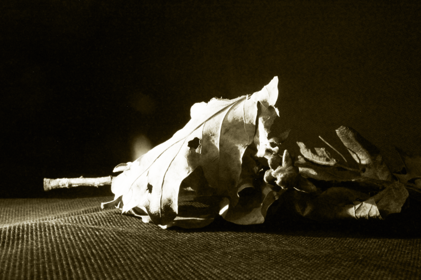
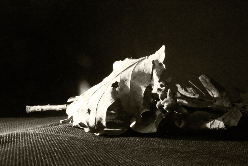
This image was taken by Horst P Horst (born 14 August 1906, died 18 November 1999 at 93 years old). Horst was a German-born fashion photographer considered one of the masters of the medium. However, I am going to be focusing on his kaleidoscopes and his work with light and dark with flowers and other objects. This is also one of the photographers I am going to be researching further in this project. This image shows a flower up close so that you can see its textures and patterns. The light is angled so that you can see more of it on the right side of the image and it gets darker the further left you look. The pitch black background adds to the contrast between light and dark. You can see all the curves on the flower which creates a smooth and flowing atmosphere within the image you could say.
The entire image is pretty much taken up by the flower leaving no room for a background which is why a pitch black backdrop works well here as you wouldn't be able to see a background if there was one. In my opinion the lines that create the patterns on the flower could be seen as leading lines because they made my eyes run through the image when I first looked at it. The use of lighting used creates a nice sweet spot on the right side because it creates contrast with the brightness of the right side and the darkness of the left side. Horst has used a central focal point to make this image which adds a realistic tone to the image. For this kind of image the f/stop wouldn't matter too much as there is no background so you wouldn't have to worry about the depth of field, but if I had to guess I would say he used f/2.8 or f/4. Unlike the f/stop, the ISO would be quite important in this image because it's what controls the light intensity on the final image. I would say the ISO would need to be increased on this image because it's inside (I'm guessing) meaning there is no sunlight. The ISO would probably be around 800-3200 depending on how much artificial light is being used. The white balance has a similar situation to the ISO because you only need to use two settings when you're inside, tungsten (3200K) or fluorescent (4000K). This image is perfectly exposed meaning there is no lens flair or anything ruining the lighting in the picture. Horst may have used a tripod for this image but it is very close up which means he may have had to hold the camera closer. I think there is a chance that this image could have been edited in Photoshop to make the brightness and contrast better but due to the fact that Horst was born in 1906 I don't think Photoshop would've been around when he took this picture. The main colours of this image are black and white. This adds a great contrast and is what I will be trying to replicate with my work. There is a clear pattern shown in the flower with its lines.
I like Horst's work because he uses different styles of shoots to express the contrast between light and dark. Also his kaleidoscopes are a really good way of showing the difference between dark and light tones. Horst is best known for his photographs of women and fashion, but is also known for his work with interior architecture, still lifes (especially ones including plants), and environmental portraits. I would like to link Horst's work to mine by editing my photos in the style of his kaleidoscopes using Photoshop because they would make my gallery look complex in contrast to the plainer looking just black and white images and will hopefully give me more marks. A strength I can say about all of his work is that he uses lighting very effectively to create different tones and shadows. A weakness I could say about his work is that some of his framing could be better but most of them are fine. I would like to achieve this sort of image because I think to have an outcome of mine look like this image would be good for my final gallery. I want my final outcomes to clearly show off the difference between light and dark and also show how different tones of a shade/colour can affect an image. I can use this image as inspiration because the lighting is used very effectively and makes the light vs dark element very clear. Also the close up angle allows for the textures and patterns of the object to be seen which adds more to the image.
Alexey Bednij moodboard:


Photo analysis 3:

This image was made by Alexey Bednij (he is a 28 year old Russian photographer who works with manipulative black and white digital photography work. He captures the shadows of subjects such as people, cats, dogs, birds, etc, manipulating the shadow that it casts). The image here is a picture of very dark birds and their shadows. The shadows and some of the birds, however, have been edited in through the use of manipulation to create a more dynamic/packed image. If you look closely you can see that some of the birds and their shadows are the same because they have just been duplicated through editing. You can see a clear contrast in the light and dark theme with the shade of the floor and the shade of the birds and their shadows. If you can see it, there is a leading line being used throughout the birds creating a sort of path through them. The birds all create a jam-packed image because they have been duplicated to make the whole background covered.
It has been taken from a birds eye view which is ironic as the subject is birds. This makes the birds seem inferior and small which adds a sense of power, control and dominance to the image. The f/stop wouldn't matter too much as there is no background therefore if I had to assume I would say he used f/2.8 or f/4. The shutter speed would have had to be very high because the photographer would need to have taken a picture of a moving animal, meaning the shutter speed would be around 1/250 or even 1/500. The fact that this image looks to have been taken outside has a great effect on the ISO and white balance. The ISO would need to be kept low if you are outside so the image won't be over exposed, meaning I will assume his ISO was around 400 or below. For his white balance, there are three settings that could be useful for an outside shoot: daylight (5500K), cloudy(6000K) or shade(7500K). It is hard to decipher which one he used because the image is in black and white... To me the image is not over exposed because there isn't any evidence that it is, which suggests his ISO was low. Because birds are an animal that move around a lot it would be useful to use a tripod to avoid getting an out of focus picture. However, as it was taken from a birds eye view I can assume that it could have been hand taken because it would be hard to get a birds eye view image using a tripod. The main colours in this image are black and white which creates a light and dark contrast within the picture. Personally I can see a sort of zig-zag pattern that the organisation of the birds have made. However, this may have been done purposefully because the image was edited meaning he could've put the birds there in order to make the pattern, or it could just be a coincidence. The birds also create a sort of symmetry within the image.
I like Alexey's work because he uses different styles of images to show the contrast between light and dark and he uses different techniques in his pictures. For instance sometimes he will use leading lines and sometimes he will use symmetry. His work links to mine because I also want to use things like shadows to show the contrast between light and dark. I also want to try and do some work with leading lines and symmetry because I think experimenting with different techniques is a good way to get more marks and improve the quality of my final gallery. A strength in his work is his use of different techniques like leading lines. A weakness in his images is that sometimes his framing isn't perfect and you can see things I don't think you should be seeing in the image and it ruins it. I would like to achieve this sort of image because the symmetry could give me more marks as I have never tried to experiment with symmetry. I would like some of my outcomes to look like this because it looks very complex and the skills with Photoshop could also get me more marks and improve my final gallery. I will use this image as inspiration for use of symmetry and what kind of manipulations I could do.
Brassai moodboard:


Photo analysis 4:

This image was taken by Brassai (born 9 September 1899, died 8 July 1984). He was a Hungarian-French sculptor, medalist, writer and filmmaker. He became famous in the 20th century. He was one of the photographers who got famous between the world wars. This picture shows a bridge being reflected in a lake. The top of the image shows damage to the bridge. In the background you can see another bridge with lots of lights. You can also see boats on the lake which could mean this lake was used to transport goods. The lights in the background create a long reflection in the lake. There are some trees on the left side of the image. You can clearly see that it's night time which makes it easier for the reflection of the lights to be seen. The reflection of the bridge creates a circle in the middle of the image. The framing of the image makes the reflection look like a tunnel. There is a contrast in texture because the water is still and smooth but the bridge is rough and scratchy.
The foreground of this image is the bridge and it's reflection that creates a circle making it look like everything else that's in the image is inside the circle. The middle ground would be the trees, the lights and their reflections on the water, the other bridge and the boats. The distance is used in this image to capture the buildings in the further background. Brassai has used symmetry in this image, this creates a circle in the middle of the image which makes it seem like the rest of the image is within this circle. Brassai has used a central focal point which creates the sense that you are there and you are the one looking through the circle. The background in this image is still in focus but the distanced background is out of focus, therefore the f/stop would have to be around f/22. This image was taken outside so the white balance would have to have been either daylight (5500K), cloudy(6000K) or shade(7500K). Because it's night time the ISO would need to be increased in order to let more light in so you can see, therefore it would be around 400-800 maybe. Some parts of the image is over exposed like the lights on the right side of the image, however the rest of the image is fine. Due to the fact that Brassai was taking these pictures between the two world wars it is highly unlikely that they were manipulated by him, however they could have been edited by someone else more recently to adjust the contrast and brightness, etc. The main colours in this image are black and white which creates a contrast between light and dark. The post in the water next to the bridge helps frame the image.
I like Brassai's work because he uses things like street lights to create the contrast between light and dark. He is mainly known for his dramatic pictures of Paris at night. His work links to mine because I am going to try use things like street lights to show the contrast between light and dark. I am also going to try take pictures of things like bridges at night. A strength of his work is that he is really good at using his surroundings to his advantage. I am hopefully going to achieve this sort of image because it uses a lot of skills and would be a good way to show the contrast between light and dark. I would prefer my outcomes to look like the ones with the trees and the lamp posts because the lamp posts would stand out and create a better light and dark contrast. I can use this image as inspiration because of the way it's framed and the amount of compositions used in it.
Plan for shoot 1:
Aims for shoot:
For my first shoot I am going to be using inspiration from Horst P Horst because I really like the style of work he has made and I want to replicate this in my own way. To do this I am going to take pictures of flowers from different angles with different lighting and a dark backdrop to hopefully create shadows and silhouettes that can contrast with the shade of the flower.
Link with photographer:
I'm going to try and link this shoot to Horst P Horst because the mood board I made on him has a lot of flower work and I think I could take similar photos to his. Also I might want to make a few kaleidoscopes to link this shoot to his work further.
Location:
This shoot will take place in a studio set up.
Props/items needed:
For this shoot I will need the following: flowers, maybe leaves, any other objects I could experiment with while doing the shoot. Leaves and flowers would be good for this shoot because their shapes and patterns mean I could get different levels of light on certain parts of them.
Kit needed:
For this shoot I will need the following equipment: canon camera, lamp/light source, dark background, dark surface.

|

|

|
Potential camera settings:
F-stop: I want the main focus of the image to be the object and the background to be slightly out of focus, therefore I will use an F stop of 2-5.6.
White balance: I am indoors so I will need to use Daylight, Tungsten or Fluorescent depending on the amount of sunlight that gets through to the image.
Shutter speed: I won’t need a high shutter speed, therefore a shutter speed of 1/125 of a second would be ideal for an inside shoot with good lighting.
ISO: I will keep this low to keep the objects sharp and in focus. Therefore the ideal ISO would be around 100-200.
Shoot 1:
Leaves:


Flowers:


Best:
The F-stop for this image was low because the background is out of focus making the main focus of the image the actual subject, this means the F-stop would be around 5.6. My white balance was on automatic because the lighting made it hard for me to decipher which white balance to use as it was also dark in some places, the only white balance settings I could have been using would be tungsten (3200K) or fluorescent (4000K) because these are recommended for inside shoots. My ISO was kept low (around 100-200) because it was a very dark space and having the ISO higher will cause it to be too bright and over-exposed. My shutter speed was also left on automatic because the darkness caused the camera to take longer to take the picture and I kept moving the camera, making the image out of focus, therefore having the shutter speed on automatic helped with this issue. I have used spacing in this image on the left side where the light was coming from. This space was also important for the lighting because I didn't want the light to be too close to the subject as it would make it too bright like in some of my other pictures. This effect made the flower darker in some parts and lighter in others which is what I was wanting the outcome to be. I used a central focal point for this image because it was the only angle where I could get the lighting effect it has which benefited it a lot.
|
Worst:
I used a higher F-stop for this image, I can see this because the background is still in focus (it was around 18), this means the main focus of the image wouldn't have been the subject because you can see other parts of the image. The white balance and shutter speed were still on automatic for this image because of the reasons I have explained in the best image, these are the only things good about this image. The ISO was a little too high (maybe around 500) because it is very bright and it wasn't supposed to be this bright, you aren't supposed to be able to see the background which is why I chose a dark backdrop. I have used too much spacing in this image and this caused the subject to hardly be in the image, which draws a lot of unwanted attention to the background. The angle this image is taken from (central focal point) means you can see a crease in the fabric which makes the image less aesthetically pleasing. The lighting was too intense in this image as well which causes the whole setup to be visible, this isn't what I wanted my final outcome for this shoot to be which makes this image one of my worst. If I could retake this image I would make sure the lighting wasn't as intense, the angle is better so you can't see as much of the background. I would also make the ISO and F-stop is lower as this would make the background out of focus and the lens wouldn't reflect as much light as it did.
|
Edit 1:


Edit 2:


Edit 3:


Edit 4:


In this edit and the next few edits I tried to use Horst P Horst's work as inspiration by making kaleidoscopes out of my pictures.
Edit 5:


Edit 6:


Original:

I am going to use the influence from Horst P Horst's work to create an outcome demonstrating my response to light and dark. I am going to use Photoshop and mainly focus on these tool: Black and white filter, brightness/contrast, magic wand tool, cropping and flipping.
Outcomes:


Edit 7:


Original:

I am going to use the influence from Horst P Horst's work to create an outcome demonstrating my response to light and dark. I am going to use Photoshop and mainly focus on these tool: Black and white filter, brightness/contrast.
Outcomes:
Plan for shoot 2:
Aims for shoot:
For my second shoot I'm going to set up utensils like forks so that they give off a good shadow and use lighting to manipulate the shadows to make them smaller or bigger. I want to use different angles and layouts with the utensils as well as using lighting to manipulate the shadows. I also want to use wine glasses to create a nice effect with the glass that I could try to manipulate using Photoshop.
Link with photographers:
I am going to do this shoot in the style of Alexey Bednij because he was the inspiration for this shoot. His work with forks and the way he lays them out to create a shadow is very intriguing and complex. He uses leading lines with the fork's shadows.
Location:
This shoot is going to be in a studio shoot in a dark room.
Props/items needed:
For this shoot I will need some forks and wine glasses. The forks will be useful because they can create a nice shadow which is the point of the shoot.
Kit needed:
For this shoot I will need the following equipment: a spotlight, a dark backdrop, a camera and maybe a tripod.

|

|

|

|
Potential camera settings:
F-stop: I want the main focus of the image to be the object and the background to be slightly out of focus, therefore I will use an F stop of 2-5.6.
White balance: I am indoors so I will need to use Daylight, Tungsten or Fluorescent depending on the amount of sunlight that gets through to the image.
Shutter speed: I won’t need a high shutter speed, therefore a shutter speed of 1/125 of a second would be ideal for an inside shoot with good lighting.
ISO: I will keep this low to keep the objects sharp and in focus. Therefore the ideal ISO would be around 100-200.
White balance: I am indoors so I will need to use Daylight, Tungsten or Fluorescent depending on the amount of sunlight that gets through to the image.
Shutter speed: I won’t need a high shutter speed, therefore a shutter speed of 1/125 of a second would be ideal for an inside shoot with good lighting.
ISO: I will keep this low to keep the objects sharp and in focus. Therefore the ideal ISO would be around 100-200.
Shoot 2:
Forks:


I really wanted to do more work around shadow effects because I liked the idea, however I didn't think it fit with the rest of the styles of shoots I have developed in more detail. Therefore I discontinued this style.
Pinterest moodboard:


Plan for shoot 3:
Aims for shoot:
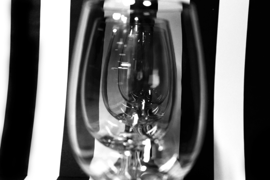
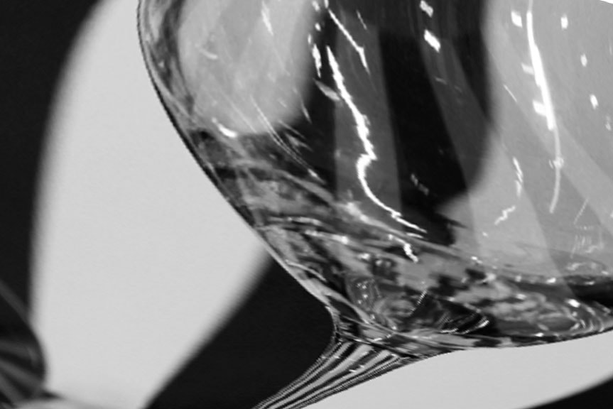
For my third shoot I am going to use a stripy black and white background with some glasses filled with water to create a pattern effect in the water, while also showing off the light and dark theme.
Link with photographers:
This shoot could link to the photographer Darek Grabus who I have not done an analysis on but is a great example of someone who does work like this.
Location:
This shoot will take place in a studio room with the right lighting.
Props/items needed:
For this shoot I will need the following props: stripy black and white backrground, glass of water. The glasses are important because that is what will create the effect and their curved edges will manipulate it well. The stripey background is the foundation for the effect I'm trying to pull off.
Kit needed:
For this shoot I will only need a camera and the lighting.

|

|
Potential camera settings:
F-stop: I want the main focus of the image to be the object and the background to be slightly out of focus, therefore I will use an F stop of 2-5.6.
White balance: I am indoors so I will need to use Daylight, Tungsten or Fluorescent depending on the amount of sunlight that gets through to the image.
Shutter speed: I won’t need a high shutter speed, therefore a shutter speed of 1/125 of a second would be ideal for an inside shoot with good lighting.
ISO: I will keep this low to keep the objects sharp and in focus. Therefore the ideal ISO would be around 100-200.
White balance: I am indoors so I will need to use Daylight, Tungsten or Fluorescent depending on the amount of sunlight that gets through to the image.
Shutter speed: I won’t need a high shutter speed, therefore a shutter speed of 1/125 of a second would be ideal for an inside shoot with good lighting.
ISO: I will keep this low to keep the objects sharp and in focus. Therefore the ideal ISO would be around 100-200.
Shoot 3:
Single glasses:


Glasses on its side:


Multiple glasses:


I realized after the shoot that I forgot to add water in the glasses so the effect didn't come through.
Best: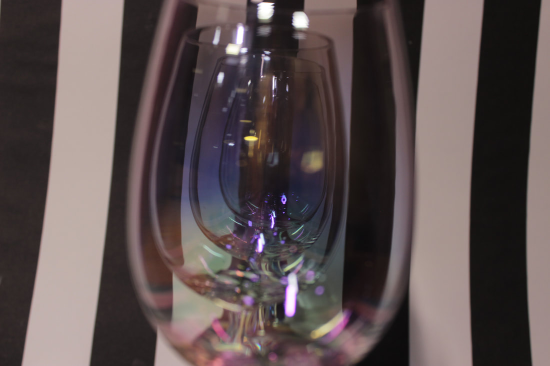
The F stop for this image was a lot lower compared to the others previously because I changed all of the settings as the pictures weren't coming out the way I wanted... The F stop for this specific image was around f/1.4 or f/2. This caused the background to be out of focus and the main focus of the image was forced to be the glasses. My white balance was on auto for this shoot, but if I had to guess, the most likely setting it would be on could be daylight, tungsten or fluorescent because these were recommended to me for inside shoots. I was continuously changing the ISO throughout this shoot to see how it would effect the outcome of the image, it seemed a lower ISO was better overall as this image had an ISO of around 200 or 400. This meant it wasn't too bright like some of the other images, but it wasn't too dark either. For most of this shoot the shutter speed was way too high but towards the end I turned it down and it made a significant difference. The shutter speed for this image was around 1/40 which made it a lot easier to take the picture without it being out of focus. I used the rule of evens in this image as I used 4 wine glasses to create the effect seen in the picture. I have also used repetition because the glasses are all inside each other, or so it seems that way in the image. The use of central focal point was important for the effect because without it you wouldn't be able to see it.
|
Worst: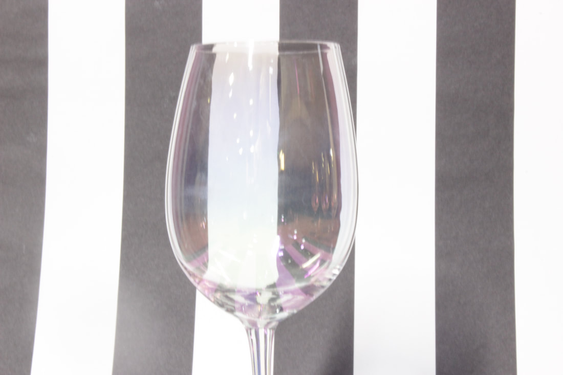
I used a higher F stop for this image which caused the background to be more prominent. The F stop for this image was around f/4, which isn't that much higher than my best picture but you can see the difference. Again, the white balance was on auto. However, I had an artificial light shining on the setup for this image and that could have affected the white balance. My ISO was way too high for this image as you can tell because it makes it over exposed. The ISO was around 800 or even higher for this image. This was one of the images where my shutter speed was too high (around 40) which meant I had to hold the camera still for longer, which didn't work for me as most of the images where the shutter speed was too high are out of focus. I used the rule of odds for this image to make the subject of the image the glass on its own and nothing else to take the focus off it. I used central focal point because I wanted to make the stripey background wavy in the glass but it didn't really work. If I could take this image again I would make sure to turn the ISO and shutter speed down and maybe take away the artificial light.
|
Edit 1:


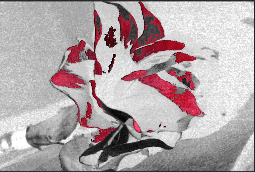
In this edit I tried to make a contrast between the lighter and darker shades of blue by making them more prominent, however I was still left with some other colours. I tried to do this to show that light and dark isn't just black and white but also shades of colours.
Edit 2:


Edit 3:


The first edit I did in this style was a little grainy, so I found a different way of editing it that wasn't grainy. Instead of using the black and white tool I selected calculations and it let me make the image black and white without it going grainy.
Edit 4:


Edit 5:


Edit 6:


Edit 7:


Edit 8:


Edit 9:


To create these edits I used the distort and the warp tool to make the images as weird as possible.
Edit 10:


Edit 11:


Original:

Outcomes:


Final gallery:


Project evaluation:
This project was Light and Dark. Initially I was most intrigued by this project compare to the others because I thought it was the most 'professional-looking' and it had lots of different approaches; I thought like and dark would only have to be black and white, however I learned that it could be linked to shades of colours and how they convey the contrast between light and dark too. At first I had a few different styles of shoots that I was interested in experimenting with, but eventually I decided to put most of my effort into the glasses and the manipulations I could make with them without the use of photoshop.
The part I found most fun about this project was the editing aspect and making the light and dark features stand out. I think my most successful edit where I showed off the actual contrast of light and dark was with the flowers: The difference in the brightness and darkness was very prominent in the kaleidoscopes I developed. I enjoyed taking the pictures as well, as I could imagine what the final outcome would look like when I was taking it, but I think actually making the final product was better than imagining it.
A new technique I had to use a lot in this project was the use of lighting and the positioning of it to make the shadows the way I wanted them and to get the darkness in places I wanted for the edits. Finding the right angle would sometimes be a hassle and would require some patience, but after a while I got better at judging how the light would affect the image and be able to have it set up quite quickly. A skill I would like to develop further in the future is being able to go on to edit for a purpose like advertisement or entertainment.
The photographers I researched through the course of this project have involved people like: Willy Ronis, Alexey Bednij, Horst P Horst and Brassai. I think the most influential out of these for me has been Horst P Horst. While they have all been influential in different ways, it was Horst P Horst's work that I wanted to replicate. His work on kaleidoscopes is what inspired me to do my own, which is what I think is my most successful piece of work from this project personally. Also, the mood board I made on him is what inspired me to do one of my shoots, therefore without his inspirations, my work would be a lot different to what it is now.
As I have already pointed out, I think my most successful piece of work out of this project was my editing. My personal favourite being the kaleidoscopes that portrayed the contrast between light and dark flawlessly. I think the outcomes of my edits have been very complex. especially for the glass edits, and they are probably the main aspect of the project because without them there would be no evidence of a light and dark contrast being attempted. Therefore the edits are the most important and the most successful.
I encountered a few problems as I was starting my project and trying to think of what approach I should take, because there was so many. This meant I was wasting time trying to figure out what I should do with the project and even considered other projects as an alternative if I couldn't think of anything. However, I decided to do more research into the project and find inspiration for what I should do and how I should approach such a vast project. Eventually, I found enough photographers and I could analyze there work for ideas. This led to me deciding what I wanted to make out of this project. This affected my final pieces overall because without the research I wouldn't have had half the ideas that are displayed on this page.
If I could start all over again and re-do the project, I would make sure to do the research early to decide what approach to take and try to make more time to do shoots because I feel like I could have done one or two more with the time I wasted not knowing what to do.
